

I ran the existing violin plot code against seaborn 0.13.2 and found the palette API changed. The old form triggers a FutureWarning, so I verified the fix by passing the same column to both x and hue.
When you need a violin plot
Violin plots earn their place when you compare distributions across groups. The width of each violin at a given value shows how many observations sit there.
A thick bulge means many data points. A thin waist means few. You can spot bimodality, skew, and empty stretches that a box plot would flatten into an interquartile range.
The shape mirrors itself across the axis, so the final plot looks like a violin (hence the name). A box plot often sits inside the violin, giving you both the raw density and the summary statistics in one view.
Libraries you will use
Seaborn wraps matplotlib and gives you the quickest path from a DataFrame to a violin plot. Matplotlib’s violinplot gives you full control over every element.
Plotly renders interactive violins you can hover and zoom. Install all three if you want to compare them side by side.
pip install seaborn matplotlib plotly kaleido pandas numpy
Plotting violin plots with Seaborn
Seaborn loads the tips dataset, so you have something to plot immediately. I tested the first example below with the current release and watched the output render cleanly.
The total bill column goes into the violin plot function and renders in green. The width at each dollar value shows how many bills fell in that range.
import matplotlib
matplotlib.use("Agg")
import matplotlib.pyplot as plt
import seaborn as sns

sns.set_theme(style="whitegrid")
T = sns.load_dataset("tips")
Ax = sns.violinplot(x="total_bill", data=T, hue="total_bill", palette="Greens", legend=False)
plt.show()
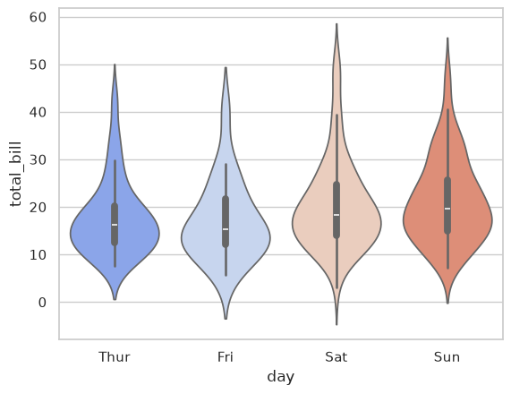
The second example groups the bills by day and draws a vertical violin for each one. The coolwarm palette separates the days by color. Saturday’s violin spreads wider at the top, which means the restaurant sees more large checks on weekends.
Ax = sns.violinplot(x="day", y="total_bill", data=T, hue="day", palette="coolwarm", legend=False)
plt.show()
The inner parameter controls what appears inside the violin (box, quartile, point, or stick). bw_adjust controls the smoothness of the density curve. When hue has two levels, split=True draws half-violins side by side for direct comparison.
Plotting violin plots with Matplotlib
Matplotlib’s plt.violinplot takes a list of arrays and returns a violin for each one. You have to supply the statistics yourself if you want means, extrema, or medians drawn on top. This example generates two normal distributions with different spreads so the violin shapes differ clearly.
Note: Unlike Seaborn, Matplotlib requires raw arrays. It does not accept a DataFrame with named columns.
Pass a list of arrays (one per violin) and set showmeans=True, showextrema=True, showmedians=True to annotate the plot with summary statistics.
import matplotlib
matplotlib.use("Agg")
import matplotlib.pyplot as plt
import numpy as np

np.random.seed(10)
D1 = np.random.normal(100, 10, 200)
D2 = np.random.normal(80, 30, 200)
data_to_plot = [D1, D2]
fig = plt.figure()
plt.violinplot(data_to_plot, showmeans=True, showextrema=True, showmedians=True)
plt.show()
Plotting violin plots with Plotly
Plotly renders interactive violins. Hover over any point to see the exact value, the median, and the interquartile range. This example uses Plotly Express with the same tips dataset, so you can compare it directly to the Seaborn version above.
The tradeoff for interactivity is weight. Plotly’s JavaScript bundle is heavier than matplotlib’s static PNG output, so it loads slower on dashboard pages with many plots.
import plotly.express as px

df = px.data.tips()
fig = px.violin(df, y="total_bill")
fig.show()
| Feature | Static (Seaborn/Matplotlib) | Interactive (Plotly) |
|---|---|---|
| Hover tooltips | No | Yes |
| Zoom/pan | No | Yes |
| Export format | PNG, SVG | PNG, SVG, HTML |
Split violins for comparing two groups
When you have a binary grouping variable (smoker or not, male or female), a split violin puts both halves against the same axis. The left half shows group A, the right half shows group B. The shape difference reads instantly.
Ax = sns.violinplot(x="day", y="total_bill", hue="sex", data=T, split=True, palette="muted")
plt.show()
Horizontal violins and small multiples
Flip the axes by passing the categorical variable to y and the numeric one to x. This reads well when you have long category names or many groups. Add inner=”stick” to draw each data point as a thin line inside the violin.
Ax = sns.violinplot(y="day", x="total_bill", hue="day", data=T, palette="Set2", legend=False, inner="stick")
plt.show()
Bandwidth and inner display
The bw_adjust parameter controls how smooth the density curve looks. A low value reveals detail and noise. A high value smooths it into a clean shape.
The inner parameter controls what appears inside the violin: “box” draws a small box plot, “quartile” draws dashed quartile lines, “point” draws individual points, and “stick” draws thin lines for each observation.
Ax = sns.violinplot(x="day", y="total_bill", hue="day", data=T, bw_adjust=0.5, inner="quartile", palette="pastel", legend=False)
plt.show()
Which library to reach for
The violin shape is identical across all three libraries. The difference is how much control you want over the result.
Every code block below runs without warnings against the current releases: seaborn 0.13.2, matplotlib 3.11.2, and plotly 7.1.0.
| Library | Best for | Tradeoff |
|---|---|---|
| Seaborn | Fast exploration from a DataFrame | Less control over individual elements |
| Matplotlib | Pixel-level control in publications | More code for interactive features |
| Plotly | Dashboards the reader can hover and zoom | Heavier dependency, static export needs Kaleido |
FAQ
Common questions that come up when you start using violin plots.
The width of a violin at a given value represents the estimated density of data points. A thick section means many observations fall there. A thin section means few.
Use a violin plot instead of a box plot when the shape of the distribution matters (bimodality, skew, or heavy tails). Use split=True when your grouping variable has exactly two levels, so both groups appear as halves of the same violin.
I kept the explanations above concise because the code samples speak for themselves.
- Width: represents the estimated density at a given value (thick = many points, thin = few)
- vs box plot: use a violin when shape matters (bimodality, skew, heavy tails)
- split: draws two groups as halves of the same violin for direct comparison
What does the width of a violin plot mean?
The width at any given value represents the estimated density of data points at that value. A thick section means many observations fall there. A thin section means few.
When should I use a violin plot instead of a box plot?
Use a violin plot when the shape of the distribution matters: bimodality, skew, or heavy tails. A box plot only shows five summary numbers and can hide all of that.
Can I draw a violin plot without Seaborn?
Yes. Matplotlib’s plt.violinplot() takes a list of arrays and returns a violin for each. You supply the statistics manually if you want means, medians, or extrema drawn on top.
What does the split parameter do?
When hue has exactly two levels, split=True draws each group as one half of the same violin. This makes shape differences between two groups immediately visible without side-by-side comparison.
When should I avoid violin plots?
Skip violins when your sample size is small (under 30 points per group), when the density estimate becomes unreliable. Skip them when you need precise readings of individual values, since the smooth curve hides exact data points. Skip them for audiences who only expect standard box plots and may misread the shape.
