


Run a profiling pass on a messy table for the first time and the report reads like a doctor listing everything wrong with a patient who skipped a decade of checkups. Twelve thousand rows fail this check. Four hundred fail that one. Forty fail this other one. Not one line of it tells you which finding carries the most data quality risk.
Your brain does the natural thing. It sorts by the biggest number.
Please do not start with the twelve thousand.
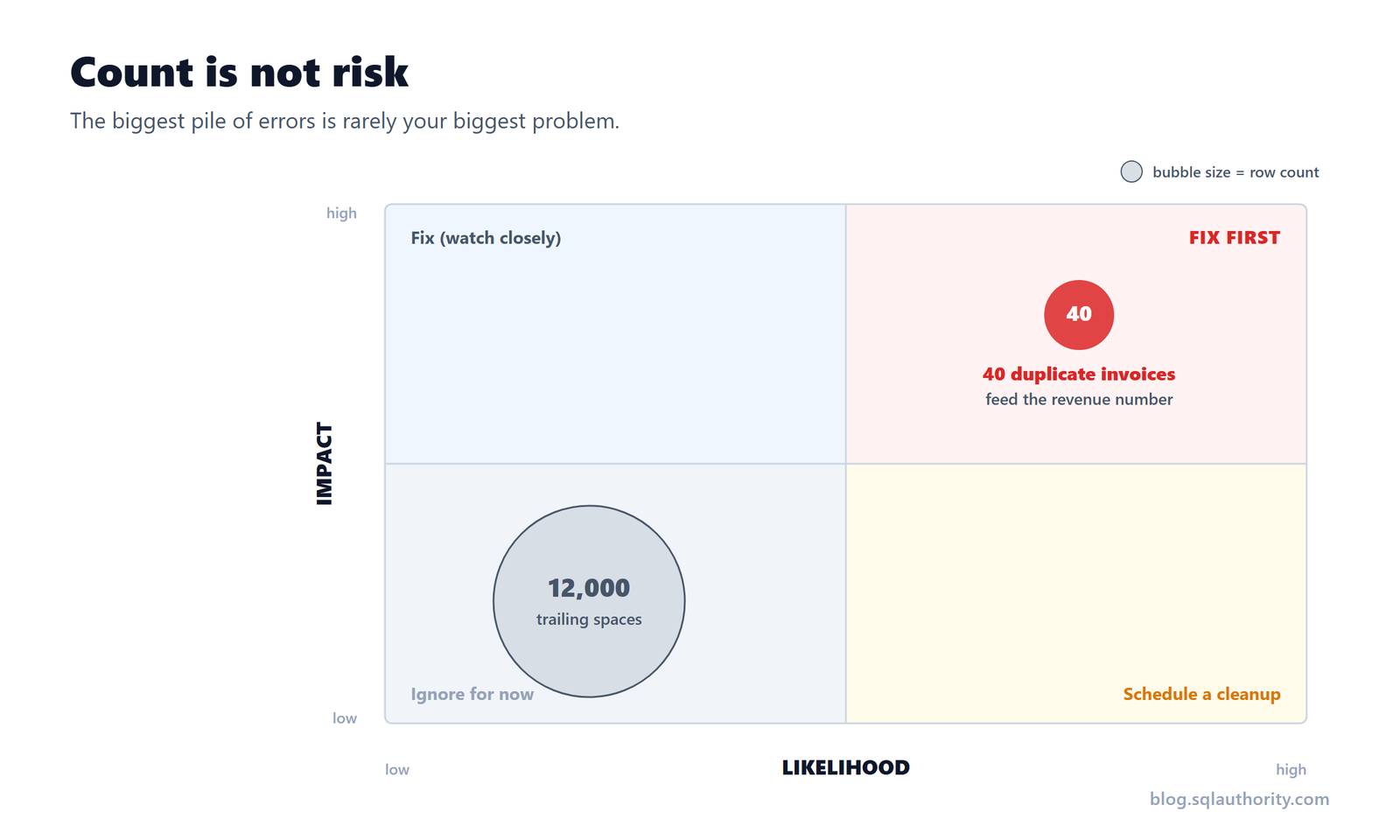
The forty rows that mattered more than the twelve thousand
On one project the profiler flagged twelve thousand rows where a product description had trailing spaces. It also flagged forty rows where the same invoice id appeared twice.
The trailing spaces affected nothing. No report trimmed that field, no join touched it, no human ever read it. Cosmetic lint.
The forty duplicates were invoices. They fed the revenue number. The number finance signs off on. The number that goes into the board deck. Forty rows of overstated revenue will ruin your quarter far more efficiently than twelve thousand rows of whitespace ever could.
Count said the whitespace was three hundred times bigger. Count was useless.
Count tells you how many. Data quality risk tells you how much it hurts.
A row count is a tally. It has no opinion about consequences. To turn a finding into a risk, ask two more questions.
Impact: what breaks, and who feels it
A wrong value in a field nobody reads costs nothing. A wrong value in a number leaders act on can cost the quarter. Follow the field downstream and see whose decision it touches.
Likelihood: how often it happens, and whether it is spreading
A one-time glitch from a migration three years ago is not the same animal as a duplicate that arrives fresh with every load and is growing.
Put those two on a grid and every finding lands somewhere.
Impact
  high | fix these        | fix these FIRST
       | (watch closely)  | (drop everything)
       |------------------|------------------
   low | ignore for now   | schedule a cleanup
       |__________________|__________________
              low                high
                     Likelihood
The forty duplicates sit top right: high impact, every single load. The twelve thousand trailing spaces sit bottom left. The grid decides for you in about ten seconds.
Turning the grid into a plan
Once the findings are placed, the priority list writes itself.
- P1, top right: high impact, high likelihood. Fix now. This is probably why you were profiling in the first place.
- P2, the two off corners: high impact but rare, or frequent but harmless. Real work, but it can be scheduled.
- Bottom left: low impact, low likelihood. This is where the courage comes in.
Three columns are enough to end most arguments.
| Finding | Who feels it | How often | Priority |
|---|---|---|---|
| Duplicate invoice ids | Revenue, and the board deck | Every load | P1 |
| Missing region code | One territory report | Occasionally | P2 |
| Trailing spaces in description | Nobody | Every load | Ignore |
Look at the bottom row. Trailing spaces happen constantly, and they still lose, because frequency without impact is just noise arriving on schedule.
Now the part nobody tells you. Choosing not to fix something is a professional answer, as long as you choose it on purpose and write it down. “We are not fixing the trailing spaces this quarter because nothing downstream reads that field” is a perfectly good sentence. What you never want is to skip the duplicate invoices by accident, because they were buried under a smaller number.
The quiet trap of a scary-looking report
Big numbers feel urgent, and urgency is a terrible planner. The forty-row problem does not look urgent. It looks like a rounding error. That is exactly why it survives.
The dangerous issue is almost never the loud one. It is the small one sitting inside a number someone important trusts.
So distrust the sort-by-count reflex. Before you fix anything, add two columns to the report: who is downstream, and how often does this happen. Sort by those instead. The list reorders itself, and the thing you were about to spend your week on usually sinks to the bottom, where it belongs.
Try this on your next profiling pass
Take your latest report. Ignore the counts. I know it hurts. For each finding, write one sentence about who feels it downstream and one about how often it happens. Then rank.
I will bet a good coffee that your new number one is not the row with the highest count.
Zero errors was never the goal anyway. Zero surprises for the people who depend on the data is the goal. Only one of those is worth your weekend.
If you want to see this risk-ranking applied end to end on a real dataset, I walk through it in my Pluralsight course, Assess Data Quality and Risk.
Reference: Pinal Dave (https://blog.sqlauthority.com/), X
