
One of the HTML elements that frequently comes into collision with CSS is the img element. As we learned in Request Metrics’ Fixing Cumulative Layout Shift Problems on DavidWalshBlog article, providing image dimensions within the image tag will help to improve your website’s score. But in a world where responsive design is king, we need CSS and HTML to work together.
Most responsive design style adjustments are done via max-width values, but when you provide a height value to your image, you can get a distorted image. The goal should always be a display images in relative dimensions. So how do we ensure the height attribute doesn’t conflict with max-width values?
The answer is as easy as height: auto!
/* assuming any media query */
img {
  /* Ensure the image doesn't go offscreen */
  max-width: 500px;
  /* Ensure the image height is responsive regardless of HTML attribute */
  height: auto;
}
The dance to please users and search engines is always a fun balance. CSS and HTML were never meant to conflict but in some cases they do. Use this code to optimize for both users and search engines!


Create a CSS Flipping Animation
CSS animations are a lot of fun; the beauty of them is that through many simple properties, you can create anything from an elegant fade in to a WTF-Pixar-would-be-proud effect. One CSS effect somewhere in between is the CSS flip effect, whereby there’s…

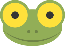
Creating the Treehouse Frog Animation
Before we start, I want to say thank you to David for giving me this awesome opportunity to share this experience with you guys and say that I’m really flattered. I think that CSS animations are really great. When I first learned how CSS…

Drag and Drop MooTools File Uploads
Honesty hour confession: file uploading within the web browser sucks. It just does. Like the ugly SELECT element, the file input is almost unstylable and looks different on different platforms. Add to those criticism the fact that we’re all used to drag and drop operations…